
The landscape of web development is everchanging, and front-end development stands as the gateway to captivating user experiences. The advent of new technologies and methodologies has transformed the way we approach building the visual components of a website.
In 2022, mobile devices accounted for 54.8% of global website traffic. Crafting responsive designs ensures your audience receives an optimal experience across diverse devices. Are you capitalizing on this mobile-first era?
The scenario of web-development practices is changing on a daily basis. With the help of this blog, let’s explore best practices and essential tools that empower developers to craft seamless and performant user interfaces.
Defining Front-end development
The process of creating the interactive and visual components of a website or web application that users can engage with directly is known as front-end development, sometimes known as client-side development. It includes the user interface’s layout, design, and functionality, resulting in the user experience (UX) that users have when interacting with a digital platform.
The job of front-end developers is to use a combination of HTML, CSS, and JavaScript to translate design concepts into code. The structure is provided by HTML, the styling is done by CSS, and dynamic behavior and interaction are added via JavaScript. These languages work well together to enable programmers to design visually beautiful, responsive, and interactive websites.
Page load times impact bounce rates. Did you know that a one-second delay can result in a 7% reduction in conversions? Optimize performance by leveraging tools like Google’s PageSpeed Insights. How fast is your website winning the loading race?
In addition to designing aesthetically pleasing user interfaces, front-end development also makes sure that user interactions work flawlessly across a range of browsers and devices. To serve a broad audience entails maximizing performance, putting responsive design concepts into practice, and upholding accessibility standards.

Let’s explore the best practices and tools for Front-end development
In the dynamic realm of front-end development, adhering to best practices as well as best tools is paramount for creating exceptional user experiences. Let’s delve into key tools and strategies that propel developers forward in this ever-evolving landscape.
- Notable tools for Front-end development: Git and GitHub: It helps in version control and collaborative development. This is used by over 90% of developers globally. Ensures codebase integrity, enables collaboration, and allows easy tracking of changes.
- Webpack: It works as the module bundler for JavaScript applications. Streamlines the packaging of assets, reduces file sizes and optimizes delivery for enhanced performance.
- Sass (Syntactically Awesome Stylesheets) and Less: CSS preprocessors for more maintainable and scalable styles. Introduces variables, nested rules, and modularization, improving code organization and reusability.
- React and Vue.js: JavaScript libraries for building user interfaces. React is favored by 40.1% of professional developers. Enables the creation of modular components for scalable and flexible UI development.
- AngularJS: JavaScript framework for building dynamic web applications. Used by 15.1% of professional developers. Enables the development of single-page applications (SPAs) by extending HTML syntax, providing two-way data binding, and facilitating the modularization of code for scalable projects.
- Sublime Text: Text editor for code editing. Lightweight, highly customizable, and supports a wide range of programming languages. Its speed and responsiveness make it a popular choice among developers.
Best Practices
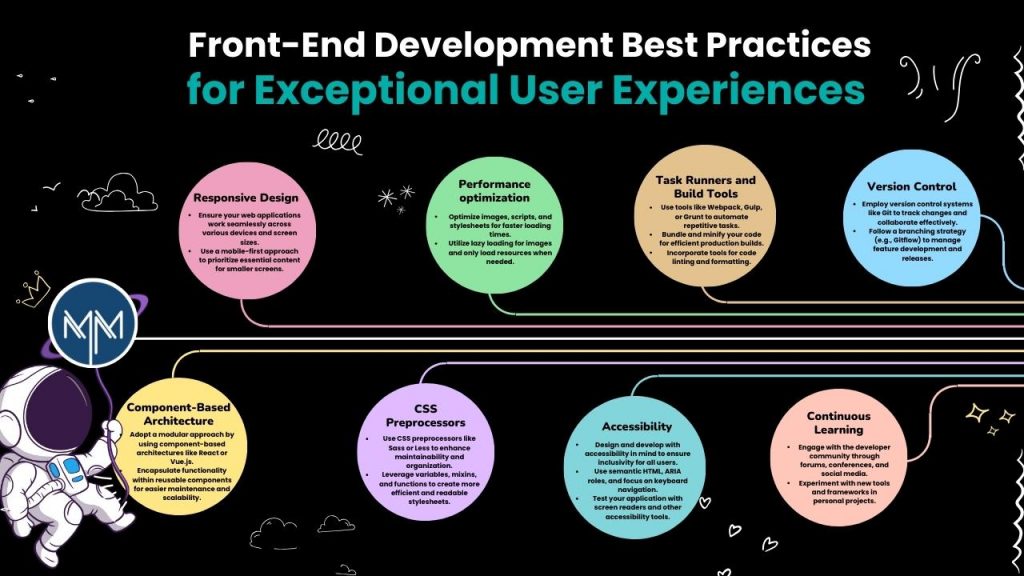
- Responsive Design: Responsive design is a key component of front-end development done right. An interface that adjusts to different screen sizes is essential at a time when customers visit websites from a variety of devices. Utilizing CSS media queries and flexible grids ensures a consistent and visually pleasing experience on desktops, tablets, and smartphones alike. By prioritizing responsiveness, developers enhance user satisfaction and engagement.
- Performance optimization: A website’s performance has a big impact on search engine rankings and user retention. To speed up page loads, front-end developers need to give optimization top priority. A faster and more effective user experience can be achieved by using strategies like browser caching, minimizing HTTP requests, and slow-loading graphics. Using resources can yield insightful information about performance bottlenecks and recommendations for enhancement.
- Task Runners and Build Tools: Automating repetitive tasks is a hallmark of efficient front-end development. Processes like code compilation, image optimization, and minification are made easier by task runners. Build technologies like Webpack also make asset bundling and packaging possible, which minimizes file sizes and improves delivery. Through the incorporation of these technologies into the development process, developers may optimize code quality and save time.
- Version Control: Version control is essential in collaborative development environments. With the distributed version control system Git, developers can easily work together, keep track of changes, and revert to earlier iterations as needed. Additional tools for collaboration and hosting are offered by platforms such as GitHub and GitLab. Adopting version control promotes efficient teamwork and guarantees the integrity of the codebase.
- Component-Based Architecture: Using a component-based architecture makes it easier to reuse and maintain code. React and Vue.js are examples of frameworks that make it easier to create modular components that combine style and functionality. This method promotes a more methodical and structured development process by allowing developers to create scalable and adaptable user interfaces.
- CSS Preprocessors: CSS preprocessors like Sass and Less introduce programming features into stylesheets, allowing for variables, nested rules, and modularization. This not only improves code maintainability but also enables developers to write more organized and reusable styles. Preprocessors compile down to standard CSS, ensuring compatibility with all browsers while providing a more developer-friendly syntax.
- Accessibility: If you are a front-end developer then you should take on the task of creating inclusive and accessible web apps. Websites that adhere to the Web Content Accessibility Guidelines (WCAG) and use accessible design techniques guarantee that users with impairments can easily navigate them. In order to promote a more inclusive web, tools like Axe Accessibility Checker can assist in locating and resolving accessibility issues.
- Continuous Learning: The landscape of front-end development is dynamic, with new tools and best practices emerging regularly. Developers must cultivate a mindset of continuous learning to stay abreast of industry trends. Engaging with online communities, attending conferences, and exploring new technologies fosters professional growth and ensures the delivery of cutting-edge and innovative web solutions.
Conclusion
Front-end development serves as the artistic and technical nucleus of web development, requiring a delicate fusion of creativity and technical prowess. In this multifaceted discipline, developers act as architects of user experiences, translating imaginative designs into functional, intuitive interfaces. Success in this field hinges on a dedication to best practices and the adept utilization of essential tools.
As trends evolve and user expectations soar, staying attuned to these nuances becomes the compass guiding developers toward success. How is your front-end development strategy aligning with these practices and tools? The journey towards mastery awaits those who embrace the pulse of innovation in this ever-evolving landscape.
At Matrix Media, our adept developers employ cutting-edge practices and tools to maintain a competitive edge. For bespoke website development tailored to your brand, reach out to our skilled team. We excel in meeting your unique requirements with professionalism and precision. Contact us to elevate your digital presence.
 October 25, 2024